Question

[Feedback] Inconsistencies between Standard and Advanced Mode in the Analysis Tab

  • February 5, 2026
  • 1 reply
  • 9 views

Hi everyone,

I regularly use the "Analysis" tab to create visualizations on our datasets, and I encounter two unexpected behaviors when switching from Standard Mode to Advanced Mode. This limits the customization of our charts.

I would like to share these two cases to see if other users are experiencing them or if an improvement is planned:

1. Missing Breakdown options In Standard mode, I have access to a full list of options for my data breakdown.

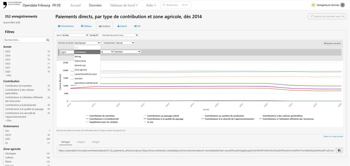
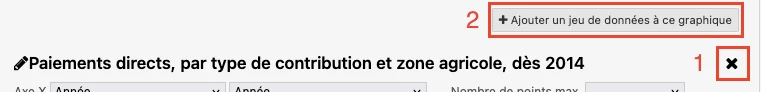
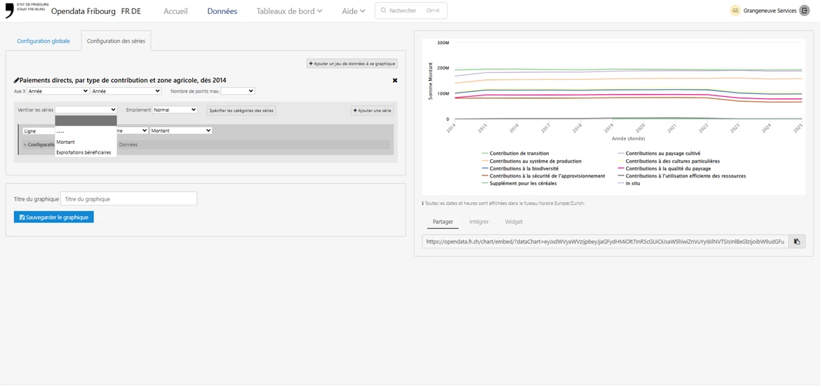
However, as soon as I click on "Edit in advanced mode", some of these breakdown options disappear from the dropdown menu and are no longer selectable.


2. Redundant label display on the X-axis When creating a time-based chart, the X-axis label displays correctly in Standard mode.


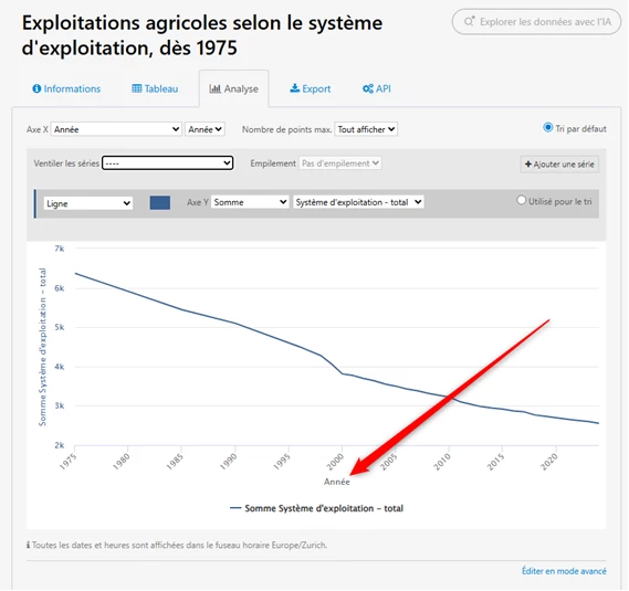
When switching to Advanced Mode, the display changes and seems to force the display of the precision (e.g., year/month), creating an unaesthetic duplicate with the main label. Even when tweaking the "Axis precision" option, I cannot find a way to hide this duplicate or revert to the clean display of the Standard mode.


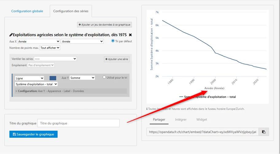
Would it be possible to harmonize the behavior between the two modes or add an option to control the display of the precision label?

Thanks in advance for your feedback or tips if you have already found a workaround!

Best regards,

Valentin Monney

1 reply

Benwa
Huwise Team
Forum|alt.badge.img
  • Huwise Team
  • February 5, 2026

Bonjour Valentin,

Thank you very much for your very precise and valuable message, which is essential for understanding your expectations regarding our data marketplace.

Indeed, I have noticed differences in behavior between the analysis tab and the advanced editor.

Thank you for pointing out these bugs. We will look into them to see if it is possible to fix them.

For the first case, I have found a workaround that may help you: if you delete the selected dataset in the advanced editor by clicking on the small cross in the top right-hand corner (1):

And if you add the dataset by clicking on the ‘Add a dataset to this chart’ button (2), you will no longer encounter the error mentioned: the breakdown drop-down list will be filled with all the fields.

For the other point, I have asked the development team to look into where this might be coming from.

However, I should point out that these two tools, the analysis tab and the graph builder, are two tools that we want to quickly replace with a new data exploration and analysis tool that is compatible with the latest, more robust technologies.

This new tool will appear in the coming months on the new marketplace experience.

We take your feedback into account to continue improving our platform and try to satisfy you as best we can.

Best,

Benoît